Last Updated on January 20, 2025 by teamobn
Ina, Nagano Prefecture, Japan – MTKarchitects
Project Year : 2014
Developed Area : 163.0 sqm ( 1760.4 Sq ft2 )
Photographs : Yuko Tada
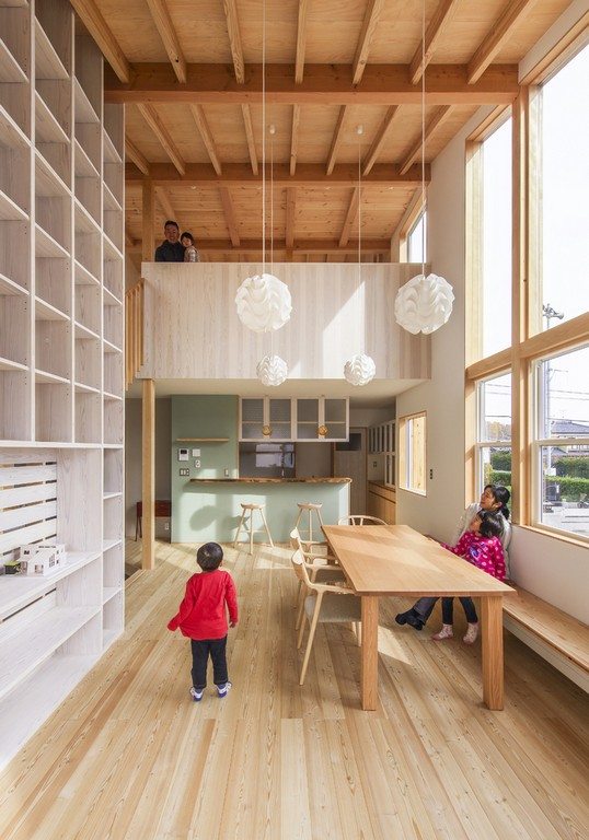
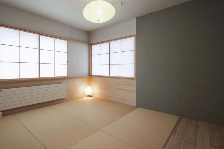
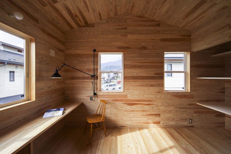
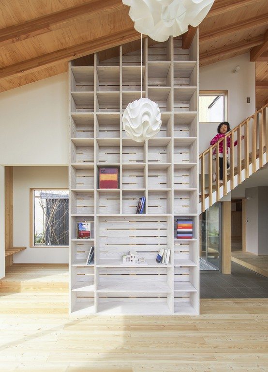
In consonance with true Japanese architecture, the Renhouse’s aesthetic is one of simplicity and minimalism. The interiors of the house are intricate but delicate, elaborate but simple.
The space gives off a clean, fresh vibe – almost too clean, albeit bordering on sterility.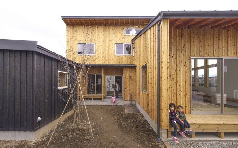
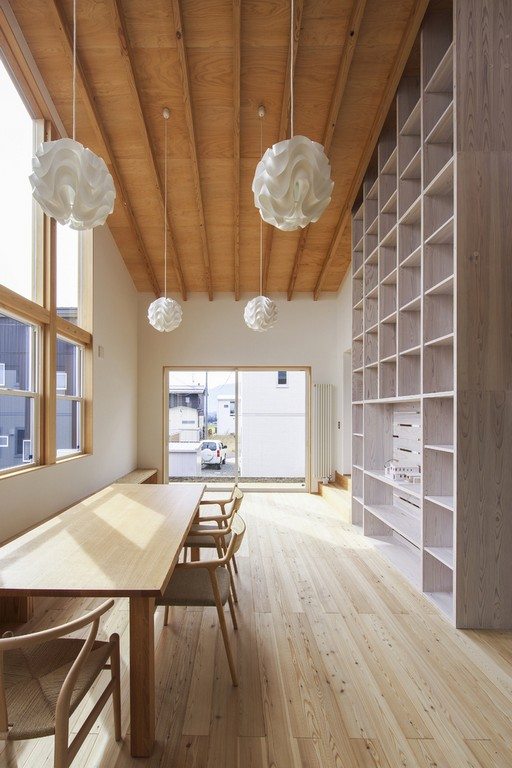
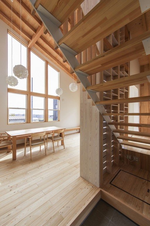
Wood, being the material of choice, connects the house to nature. Neutral palettes of brown and white dominate the color scheme. With its generous windows allowing light to freely come in and bounce through the white walls, the house lights up during daytime.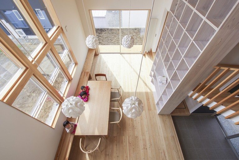
The architect’s comments:
I am always aware of harmony with the surrounding environment and neighborhood, and relations between buildings and nature when I start to design. The timber house for 2 generations located in Nagano Prefecture, Japan is sited in a quiet and rich natural environment and has wonderful views to the Ina Valley.
This “RENHOUSE” has been created as a house which suggests a strong connection with the natural surroundings.
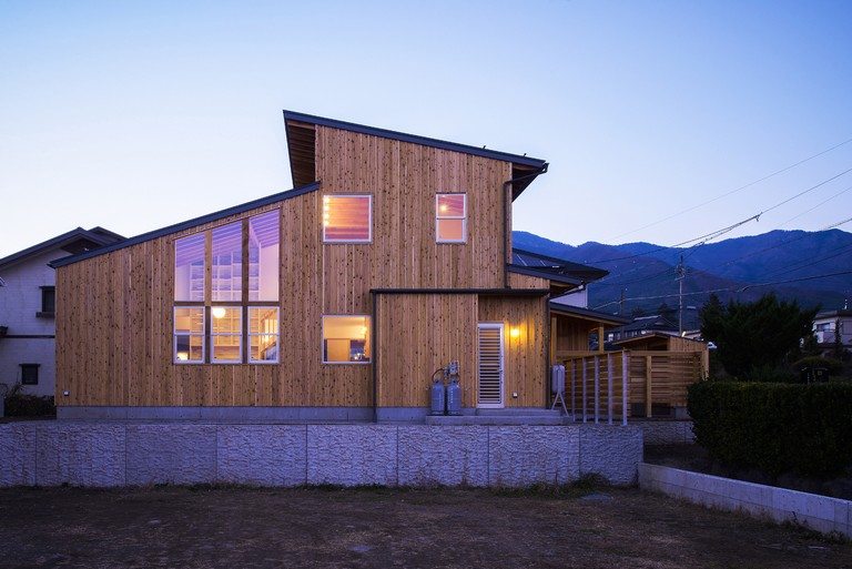
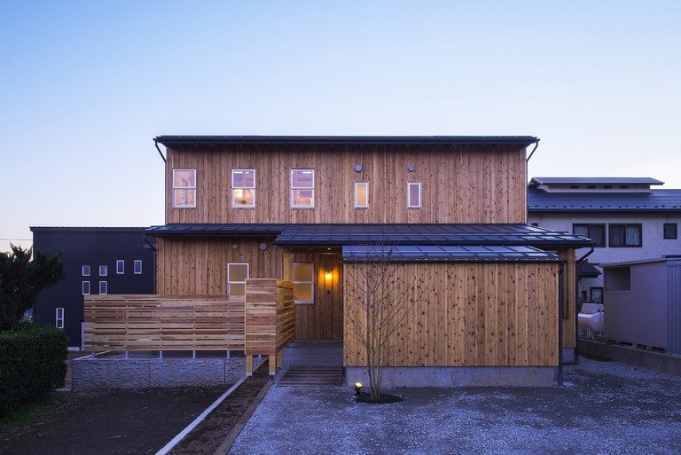
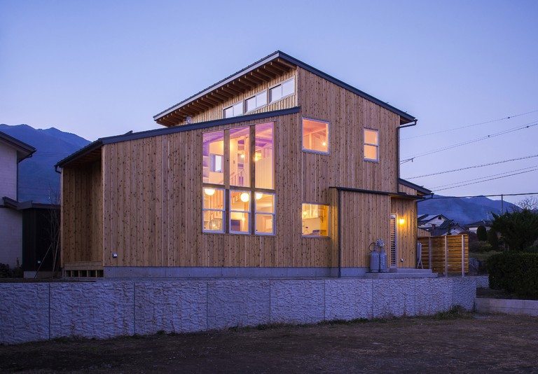
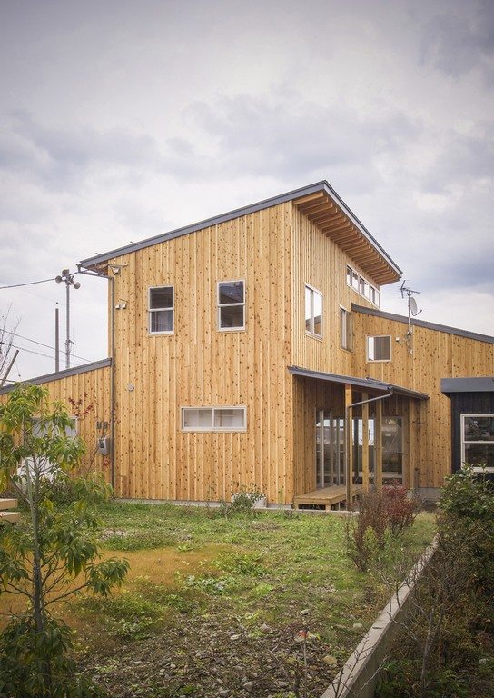
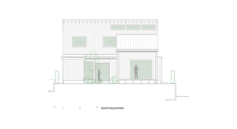
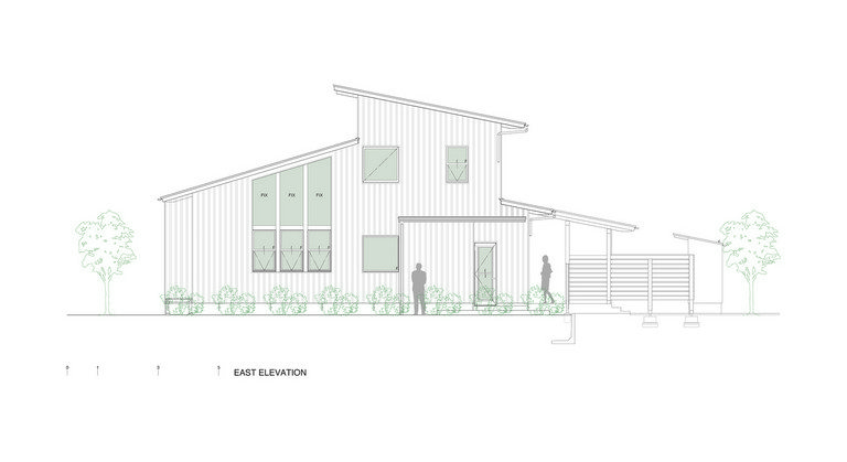
The gabled shape of the roof designed with inspiration of the line of the mountains in the background becomes integrated into the landscape. The height and form of both roof and façade are continuously adjusted to the surroundings, which also enables the house to develop its own unique character. The façade is made of cedar board and batten hat from Hokkaido that will become gradually grey over time.
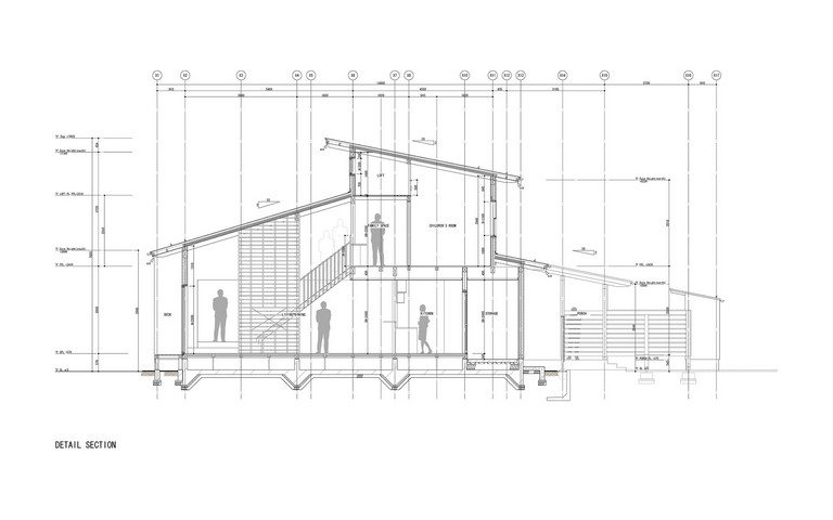
The living room features characteristic large window openings “RENMADO” allowing sunlight to penetrate deep into the space and viewing of the beautiful panorama of the outside.The contrast of light and shadow is reinforced here, adding a sense of depth and extension into the space. This RENMADO window works as a device that connects the indoor and the outside.
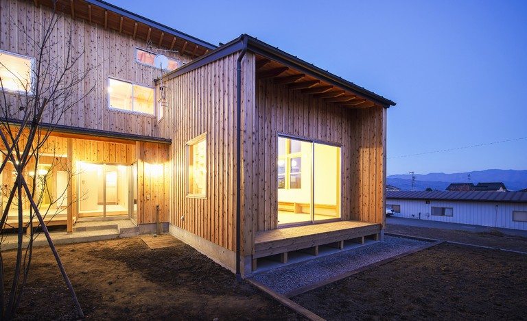
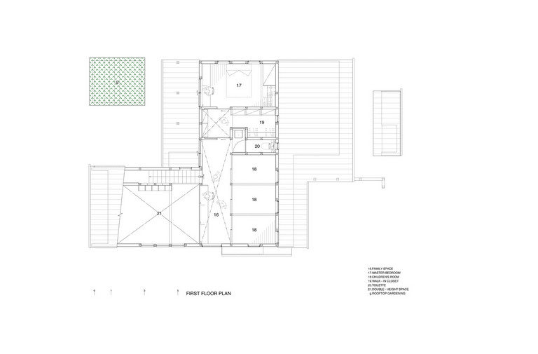
The Z-shaped plan is positioned very naturally in the site, and its form provides good separation between the two generation areas. At the same time, it provides a space including front door, corridor and “Doma” space which connects both areas in the center of the Z-shaped plan.
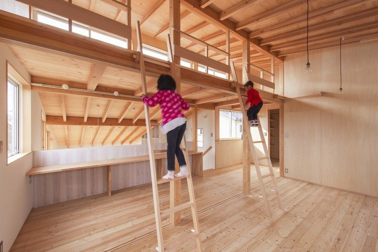
The interior has been planned appropriately according to the wishes of the occupants who wanted a design which minimized housework.
Click on any image to start lightbox display. Use your Esc key to close the lightbox. You can also view the images as a slideshow if you prefer ![]()
Exterior View of Renhouse in Ina, Nagano Prefecture, Japan:


Interior View of Renhouse in Ina, Nagano Prefecture, Japan:


Drawing View :

If you like Japanese architecture, you’ll like this post on the Roof on the Hill, too!


