Last Updated on July 25, 2025 by teamobn
Kitchen color schemes do more than make a room pretty. They set the mood, steer material choices, and influence how you store and display gear. Start with one signature shade, a pot, a tile, or a paint swatch, then build out supporting neutrals and metals.
This guide shows you how to pick, test, and execute a cohesive palette that still feels personal.
Start with a signature shade
A cohesive palette starts with one unapologetic hue. Pick a single object that already makes you smile and let it lead.
Find your hero piece
A hero piece gives your kitchen color schemes a clear anchor. It fixes the palette, clarifies undertones, and stops decision fatigue. Every other choice, paint, tile, metals, and woods, now has a reference point. You’re not picking colors in a vacuum anymore. You’re harmonizing with that single, non‑negotiable hue.
Examples span form and function. A patterned cement tile, a retro‑colored fridge, a statement range hood, a vintage runner, bar stools in a saturated vinyl, a boldly glazed backsplash, or even a pendant light with a lacquered shade can all lead the palette. Small appliances, artwork, or a painted island can do the job too if they’re always in sight.
Le Creuset cookware is a near‑perfect hero piece. It’s durable, always on display, and comes in stable, repeatable colors like Flame, Marseille, Cerise, and Nectar. You can echo that enamel on cabinet interiors, grout tints, stools, or textiles. The pot never changes tone, so it keeps your palette honest under every lighting condition.
Decide on value and saturation
Value refers to the lightness or darkness of a color. Saturation is how pure or muted it looks. Decide how much of each you can live with on big surfaces. A high‑chroma hero pot usually pops harder against slightly grayed walls. You can also keep walls neutral and repeat the saturated hue only on small accents.
Test a few value steps lighter and darker than your hero shade, then desaturate by 10–30% to find balance in your lighting. Shoot photos morning, noon, and night to see shifts. If the room feels tight, lift the value (go lighter). If it feels flat, deepen one feature, like the island, and mute everything else.
Test it in real light
Test it in real light Paint or order large samples, at least 30×30 cm. Tape them on vertical surfaces, not flat on the counter. Check them morning, noon, and night. Turn on task, ambient, and accent lights. Note Kelvin shifts: 2700K warms oranges, 4000K can cool and mute them. Photograph every setup so you catch what your eyes miss.
Keep your hero pieces beside the samples as the constant reference. Reject any color that dies at night or blows out in full sun. Live with the finalists for a week before you lock the palette.
Build the full palette
With your hero piece set, map the rest. Define roles for each color, neutral, metal, and wood. Clear rules prevent drift and make every next decision faster. You’ll know what to buy and what to skip.
Define dominant, secondary, and accent colors
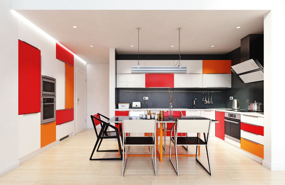
Give each color a job. Use a dominant hue for large planes like cabinets or walls. Let a supporting secondary steady the room on counters or backsplash. Reserve a high-impact accent for stools, liners, or small appliances. Stick to something like a 60/30/10 balance so the scheme feels intentional, not busy.
Pick your neutrals with purpose
Neutrals aren’t filler. They’re the buffer that lets the hero shade breathe. Choose whites, greiges, or charcoals with matching undertones. Warm neutrals soften bold reds and oranges. Cooler ones sharpen blues and greens. Sample next to your hero piece under every light source to confirm nothing flips green, pink, or dingy at night.
Metals that support the scheme
Select one primary metal finish and, at most, one secondary. Consistency across knobs, pulls, faucets, and lighting trims calms the eye. Contrast is fine, chaos isn’t. Brushed finishes mute glare and read softer. Polished finishes bounce light and intensify saturation. Write the rule down so late-stage fixture swaps don’t break the palette.
Wood tones that warm or cool
Wood behaves like a color. Oak, walnut, ash, and maple all carry distinct temperatures and grain patterns. Decide if you want warmth to counter a cool palette or harmony to extend a warm one. Stain samples beside your hero piece and neutrals. Aim for one dominant wood tone and one subtle accent to avoid patchwork.
Texture and sheen as color multipliers
Matte paints mute saturation. Gloss and polished stone amplify it. Ribbed tiles, beadboard, reeded glass, and natural linens add depth without adding new hues. Lock your sheen ladder early, matte walls, satin cabinets, honed stone, brushed metals—so reflections don’t shift how colors read across the room.
Set rules for repetition and restraint
Repeat the hero color at least three times, in three different scales, to make it feel embedded. Limit yourself to two metals and two wood tones. If a new item doesn’t fit the palette or the rules, it’s out. Guardrails like these keep impulse buys from unbalancing the scheme.
Plan a seasonal or low-cost switch layer
Bake flexibility into the palette. Pillow covers, runners, bar stools, art prints, and small lamps can rotate without repainting or retiling. Keep these swaps inside your defined accent range, not outside it. That way you refresh the space while the core scheme stays tight and timeless.
Map color to function and zones
Color should serve the task. Map hues to how each area works so kitchen color schemes guide energy, attention, and cleanup instead of just decorating.
Cook zone: energize, signal heat
Use bolder, warmer accents where the action happens. High-saturation fronts on the range hood, pot rails, or island ends keep focus where timing matters. Balance them with calm counters so food stays visually clear.
Prep and clean zone: clarity and hygiene
Shift to cooler, lower-saturation neutrals for sinks and long prep runs. High-contrast walls or backsplashes make spills, crumbs, and cross‑contamination points obvious. Stainless or brushed metals reinforce the clinical feel without stealing attention.
Dine and linger: soften and warm
Dial down saturation and deepen value to calm the eye. Think muted upholstery, rich but not shiny wood grains, and textured linens that invite touch. Warm whites, camel, olive, or oxblood create intimacy without feeling heavy.
Matte paints and honed stone cut glare so conversations, not reflections, take center stage. Put your pendants and sconces on dimmers set to 2200–2700K so the palette glows at night and meals naturally slow down. Acoustic panels, curtains, and rugs in the same softened range keep the space quiet and cohesive.
Wayfinding and storage logic
Turn your kitchen color schemes into a clear coding system. Assign one accent hue to baking, another to prep, another to bar tools, and repeat them on shelf backs, drawer liners, label bands, and even container lids.
Keep the rule visible on a small legend inside a cabinet door so guests learn fast. Use neutrals for catch‑all storage so the color codes stay obvious. Stick with high‑contrast icons or stripes if you want clarity without adding more hues. Consistency beats creativity here.
Keep traffic lines clear
Hold floors and main pathways in a steady mid‑tone neutral so movement reads cleanly. Avoid tiny high‑contrast patterns that create visual noise or hide spills. Choose grout close to tile color to keep the plane calm. Reserve your accents for vertical touch points, handles, rails, stools, art, so kitchen color schemes stay readable at a glance.
Select slip-resistant finishes and low-pile runners that match the base neutral, not the accent, to prevent the palette from splintering. This keeps the room legible and safe when it’s busy.
Conclusion
Start with one hero piece and let it anchor every choice. Build a disciplined palette with defined roles, supporting neutrals, and limited metals and woods. Map color to function so cooking energizes, prep stays clear, and dining feels calm. Test everything in real light, lock rules, and repeat hues with intent. Do that and your kitchen color schemes will look cohesive, age well, and make decisions easier for years.
To further enhance your kitchen, check out these design tips to improve your interior space!


